
Role: Brand Design
Client: eBay
Between Two Rides
Made at The Many
Director Trevor Paperny
Producer Matt Kahn, Kim Vorse
Group Creative Director Aj Rivvers
Creative Director Josh D. Weiss (Art),
Eddie Babaian (Copy)
Art Director Eric Canfijn
Senior Designer Chris Ruppelt
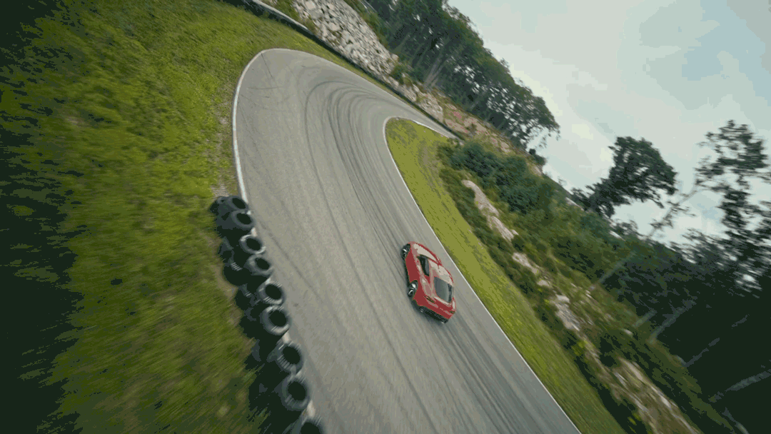
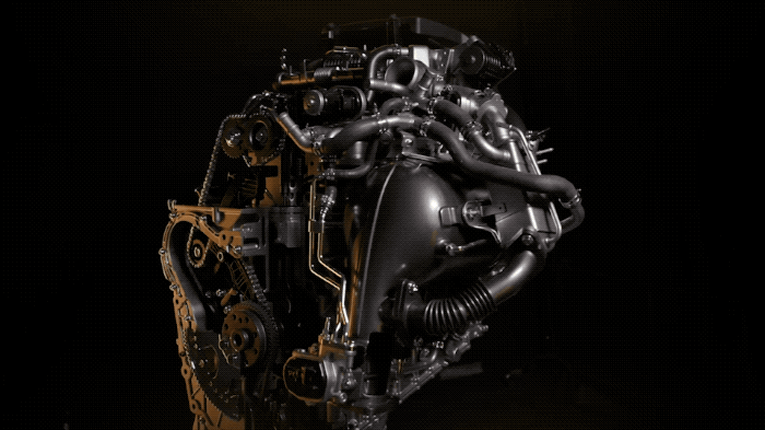
The Many had the opportunity to partner with eBay Motors and create a YouTube series that explores how the right auto parts and accessories found on eBay can transform a vehicle from stock into something really special.
There are lots of moving parts in something like Between 2 Rides, but the largest deliverables the design team is focused on are a show logo, supers and see say text, and other on screen graphic elements.
Approach
Finding a balance between the eBay brand, director’s treatment, and the personality of the show host were key to nailing a show logo and visual language that would show up on screen and other touch points.
Logo Exploration
We considered the existing eBay visual ID, the energy and speed of the director’s treatment, and the personal style and racing expertise of the selected show host Collete Davis.
Design Territories
01 Speed
Capture the excitement of auto culture: bold type that feels kinetic, and racing imagery.
02 Modularity
Tap into the visual language of utility and performance focused parts and accessories.
03 Customization
The right parts make all the difference. Show the flexibility of mods and unique possibilities.
Exploration 01
Bold and oblique type that feels fast. A checkered flag pattern speaks to competition, our host’s racing experience, and also generically to motors.
Design Territory
Speed
Exploration 02
Custom modular wordmark offers a mechanical and performance feel. The “2” icon is front and center, highlighted by energetic stars intersecting.
Design Territory
Modularity

Exploration 03
A logo with a flexible icon, cycling through different fonts and wire frames of auto parts. The icon shows our story of customization and parts and accessories.
Design Territory
Customization
Final Logo
The selected logo direction placed an emphasis on our customization territory. The emphasis on flexible possibilities, auto parts, unique customization was the ideal visual language to speak to the show and parts offered on eBay.
Design Territory
Customization
Design Territory
SpeeCustomization
See Say Text
The eBay visual identity includes their brand typeface Market Sans. We wanted to find ways to bring this font to life and give it the energy to match the the show. We played with repetition, filled and unfilled type, and other effects to add a sense of motion and excitement.
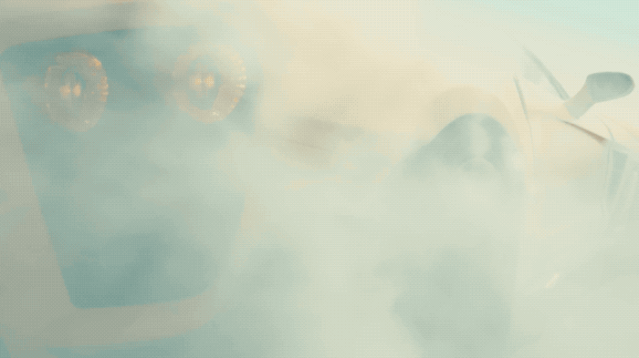
On Screen Graphics
The director’s treatment leaned in a futuristic and performance direction. Our on screen graphics captured this with visual elements like chevron patters, viewfinder and HUD display elements, grids, layered data, and type with a screen glow.
The finished episodes of the YouTube series can be viewed here.