Role: Design, Art Direction
Client: DoorDash
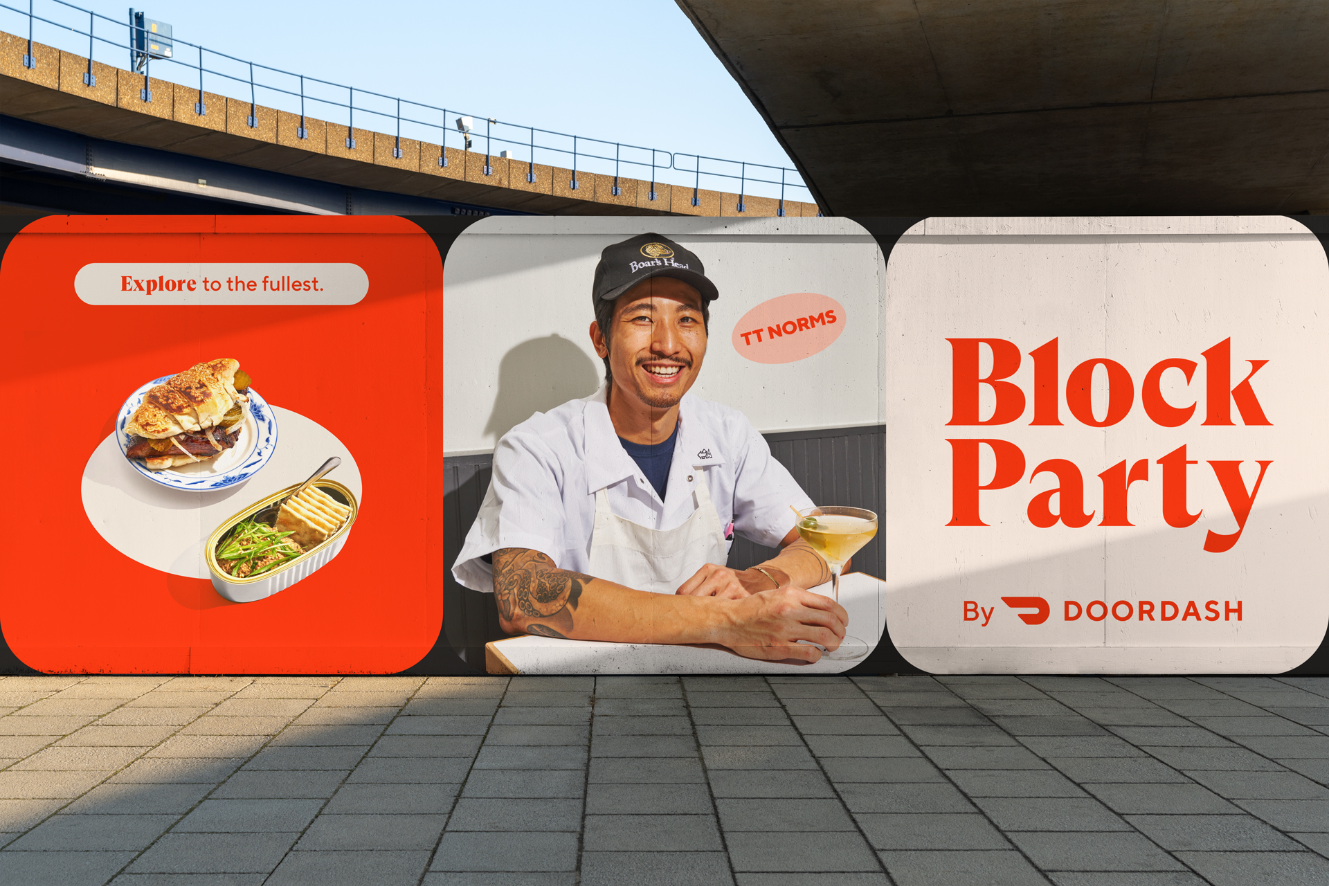
Block Party by DoorDash
Made at DoorDash (Superette)
Global Head of Design: Adriel Teles
Art Direction/Design: Chris Ruppelt
Content Agency: Toast Media Group
We had the opportunity to repurpose an existing DoorDash blog into an editorial website. The goal was to help our audience discover and shop the best of their neighborhoods and cities — and of course deliver it.
Our strategic partners, national and localized data, breadth of offerings, and scale would make us a unique guide to neighborhoods’ food, shopping, and communities. This site would need a name, logo, and visual identity.
Logo
The Block Party logo is a wordmark set in GT Super Display with some characters, angles, and terminals adjusted to better match the DoorDash visual language and connect the logo more deeply to the parent brand.
Typography
TT Norms was selected as the primary typeface used throughout most touch points and the site. As the primary DoorDash typeface this visual cue would strengthen the connection to the brand.
GT Super was chosen as a display and secondary typeface to add expression in the largest brand moments and a unique touch to the wordmark. Its serifs and bold shapes feel undeniably editorial.
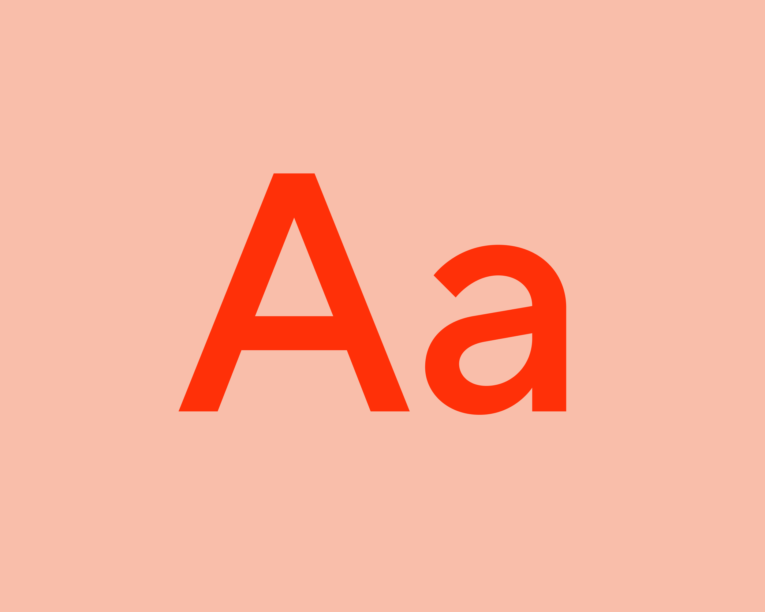
TT Norms Pro
Used most frequently in ubiquitous surfaces. Connects to the DoorDash brand.
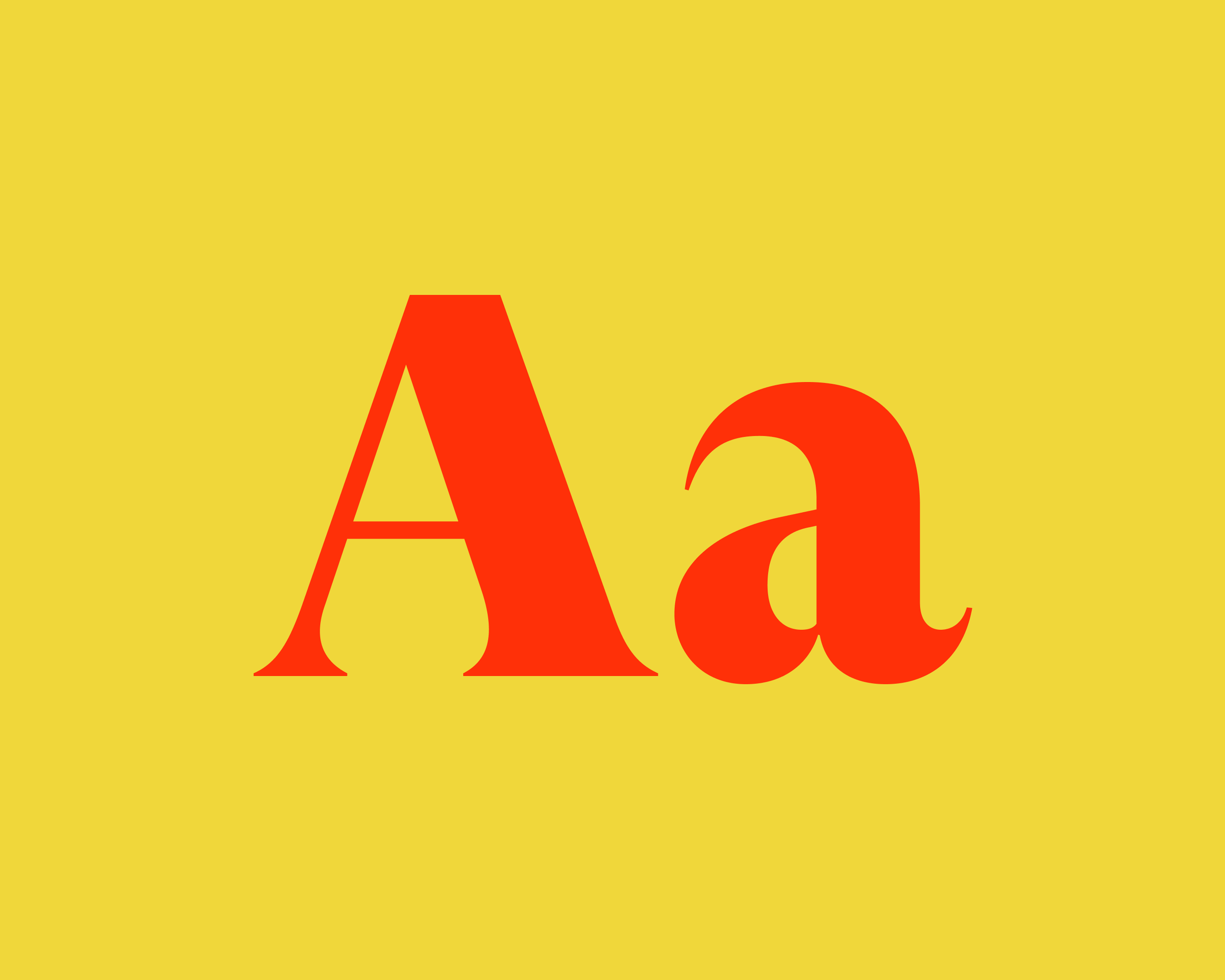
GT Super Display
Used in the wordmark and most expressive brand moments. Used more sparingly.
Color
To ensure the connection to the DoorDash brand we leveraged Delivery Red and white most prominently.
We also needed flexibility for a wide range or content. So we created a secondary palette focusing on more vibrant colors from the wider DoorDash brand palette.
Primary Palette
Delivery Red is a primary brand differentiator and pillar of brand recognition.
Secondary Palette
A wider palette of secondary colors allows for flexibility and variety.
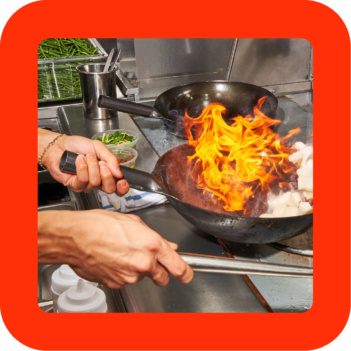
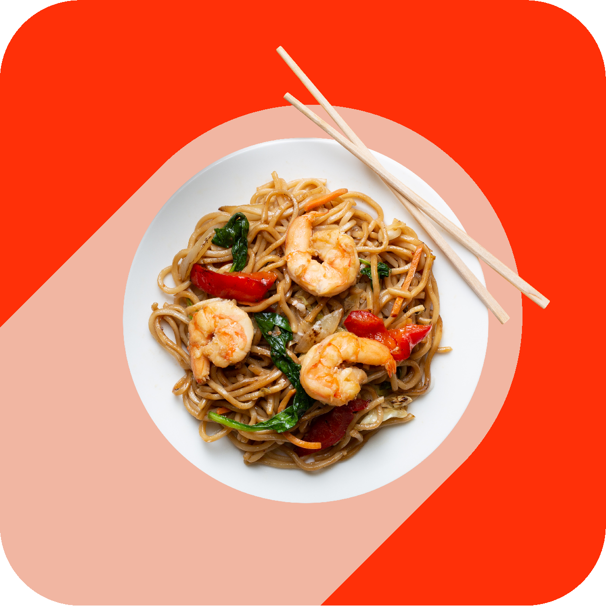
Shapes
Shapes were used to create windows that wrap around images allowing us to see into a moment or focus our attention. The geometry of these is built using the DoorDash icon to approximate the radius of a corner or the width of a border.
Shapes As Borders
A simple border with rounded rectangles can add a pop of brand color and complement photography.
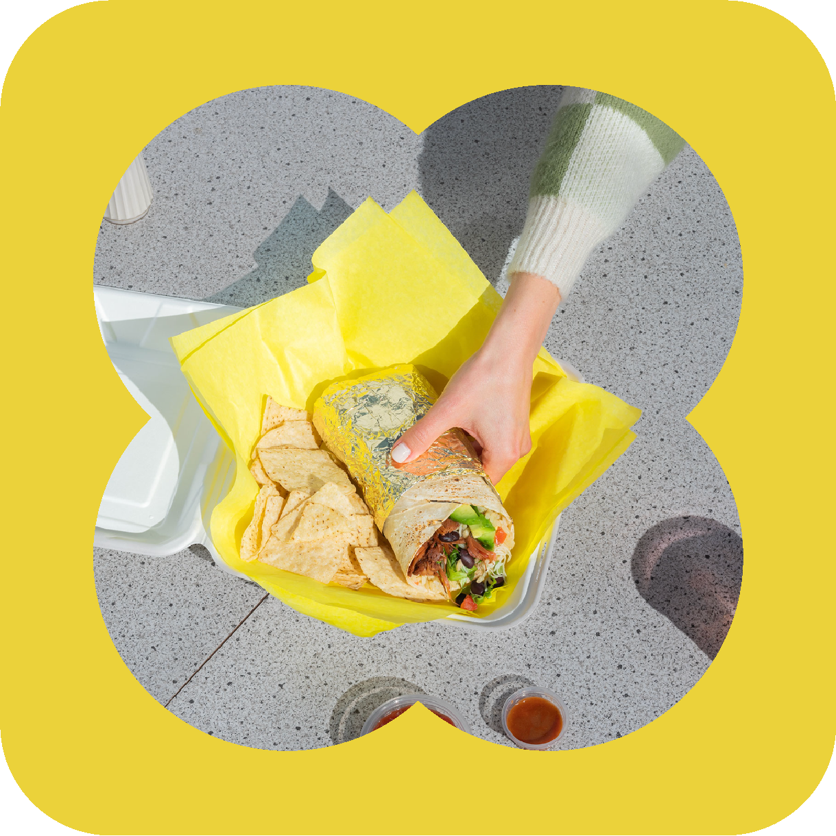
Shapes As Frames
Shapes can be playful and function like windows adding emphasis to an object or photograph.
Shapes As Background
Graphic shapes can appear behind or under photography to make stylized layouts.
Style Guide
The design system needed to be outlined in detail in a style guide. The guide was handed off to our partner agency Toast Media to inform the art and design decisions made as they created new blog posts and content for Block Party.
In Use
The design system was brought to life in playful imagery that highlighted chefs, local experts, favorite products, and unique local restaurants.